


pot.com/_V9SkjxlvgIs/S59owv_lFuI/AAAAAAAAADc/v6hU6xVSRLI/s1600-h/tumblr_kzbnpiGwNK1qav56co1_500.jpg)


Initial front cover idea no. 2: Firstly, the masthead and image are the most striking things on this cover idea. The magazine name is in bold letters, on a strong background to make it stand out. Above that, i have included a banner of a list of 'exclusive' bands. When something is exclusive, it makes the reader seem like they will find out something that not many other people new. It's new news. The barcode is at the top on this cover alongside the masthead with the date and issue number just underneath that. There's the sub-story, on the left with a small picture and a description of the article. Another banner is used at the bottom but this time it features new 'upcoming gig news' where the reader can find out about 'exclusive' gigs. On the right hand side, there's a column of 'LIVE' bands, this will feature some of the biggest names so the reader will be familiar with them and want to read more, influencing them to read the magazine. A pug is used to make the cover a bit more interesting! The main artist and description will be directly centered underneath the main striking image.

Initial front cover page idea no.2: The masthead is at the top of the magazine, aligned to the right. It's quite big, big enough to notice but it isn't the most important element of the cover. Underneath is the date and issue number. The main image is in the center of the cover, with the artist name layered directly on top of the image, i would like the image to take up the whole front cover as there's not many other images. This is good because the readers attention will be undivided and they will focus on the main image and story. A pug is in the top left hand corner with bands who are 'Live this week'. I'd like to include a pug in my final magazine idea because i like the way it looks like a sticker, and normally they draw attention in as they are a different colour from the rest of the page. In the bottom right hand corner, there's a column with some of the more important artists featured in the magazine so the artist can skim through and find an artist they particularly like. The barcode is out of the way in the other bottom corner and a 'FREE' posters part is next to that with two small images of what posters are inside.

 Analysis of double page spread initial idea no. 1: The main image this time is on the right of the double pages. The magazine name/logo is in the top right hand corner with other images of the artist below that. These will probably be live shots or images to do with the artist's current album or tour. This way there is a variety of images and the reader can see what the band look like when they play live or if they have already seen them, they can relate to the images. In the bottom right of the image page, there is a page number so it's easy to navigate through the magazine. Also, there would be a quote next to the image so the reader can get a quick insight into what the interview is all about. On the left hand page, the title is aligned to the right, mentioning the artist name in a different colour but still keeping with the magazine theme (which willl probably be yellow, black and white) and a smaller blurb underneath. So for example it could say something like 'With a new album, a headline show of 12 gigs all around the country, brutality will prevail look like they're here to stay...' and the blurb will then explain what the article is about. The interview will be divided into three columns with a quote inserted in between and a small image in one of the columns also. This is a very easy to read double page spread.
Analysis of double page spread initial idea no. 2: The main image is on just the left hand page here, a medium close up would be used, probably on a white background to create a very clean looking effect. This image would be from the same series as the one on the front cover and in the contents but obviously different pictures. The page numbers clear in the top left hand corner so it's easy to find the article you are looking for and the magazine logo is on the right of the page. The artists name will be aligned to the left below the picture, with the article starting just to the left of it continuing onto the next page for three columns. A quote will also be next to the main picture somewhere to grab the readers attention and give them a quick insight into the article. On the right, there is a large image at the top taking up about half of the page. This image would not be from the series of images on the front cover and contents. It could be a live shot of the artists, it would allow the reader to see a snapshot of what their live show would be like or if the reader has already seen them live, they would feel included and personal as they were there when the photo was taken. The article would finish with a small caption on when the artist was touring, a new album, or new side project to publicize the artist more.

Analysis of double page spread initial idea no. 3: This idea is very much based on the Biffy Clyro double page NME spread. The image is the main focus of the two pages and it catches your eye as you open the page. Again, i'd like the page number very prominent as it is in the top right hand corner, it's easy to find a page as you are flicking through. The artists name would be on the left hand side, just above the writing of the article. Not too big as if they are a main star, the reader would definitely know who they are. A small description of what the articles on will be on the right bottom hand side of the image so that the reader can firstly read this and then decide whether they are interested in the article. The article will be simply set out in four columns along the bottom third of the page, with quotes thrown in, in some places to make it more interesting. The interview would continue on another page or two. To show this, there would be a small arrow in the bottom right, pointing to the right so we know we have to turn the page. This is a very simply double page spread but i think it's very striking. Images speak words.

Contents Page Initial idea 1: All of my initial contents pages are very busy as i think it makes the reader more interested. If the reader doesn't like the main article, there's loads more to pick from. This contents page does not include the magazine name so i am not that over-keen on it. The main feature and description is on the left hand side just above where the list of artists and page articles starts. I don't think it's big enough for the reader to easily notice. In the center of the page, in between the list of pages and what's featured, i have put a picture with another article in a small box. The photo is smaller than that of the main feature, but not that much smaller! On the right, there's a column of 'LIVE' bands so that if the reader went to a gig that week, they can scan down and find the band they're looking for. I'm going to feature very small pictures of live bands in this column on the left and right to make it interesting. There's a very small editors letter in the bottom right, with a picture accompanying of the editor possibly with one of this weeks artists. Gives it more of a personal feel. I think this contents is a bit too busy and not that easy to read overall!

Contents Page Initial idea 2: I like the idea of the magazine name/logo being very prominent on the contents page so the reader remembers the magazine name. Down the right hand side of the page is the list of bands 'this week...' in alphabetical order with the page number to the right of that. So it's easy to skim through and find the band you are particularly interested in. The main story image is big enough to take up about a quarter of the page, it's from the same photoshoot as on the cover and in the double page spread so the theme continues all throughout the magazine. Smaller articles are underneath the main article with a small caption describing them and a clear page number just underneath that. As i want to page numbers constantly very clear throughout the magazine, i have put one in the bottom right of the page. Big enough to be easily read. Also there is a small letter from the editor and a picture of him/her and also a special offer at the bottom center of the page. Possibly money off a subscription, a deal would reel the reader in. This page is less packed than my third initial idea, i think it's much easier to read and the title and main article are the most striking elements.


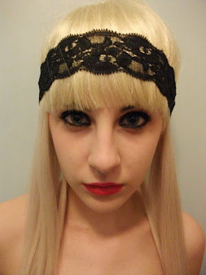
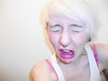
 I want to include quite grimey/dirty looking pictures, perhaps with the person smoking as that is commonly associated with the metal scene of music.